


A lengthy shoreline (~850 km) extending 6 nautical miles seaward, multiple estuaries, and vast intertidal sandflats and mudflats make up a highly biodiverse and almost entirely protected jurisdiction for the North Western Inshore Fisheries and Conservation Authority (NWIFCA). It’s not easy to monitor these waters, especially given the scope of NWIFCA’s workload, which includes both law enforcement and science work: daily inspections of vessels, patrols with the North Western Protector, seabed surveys, biomass estimations, all of which must be accurately reported to various stakeholders.
Thankfully, they have recently added Mergin Maps to their arsenal, allowing them to log sightings, gear and offences against a real location, with every closed area and protected boundary visible on the map in front of them. We spoke with Robin Love, Science Officer of NWIFCA, and he showcased how he undertook and coordinated a successful transition from pen and paper to a modern digital fieldwork tool.
For digitising notebook and pen, Mergin Maps’ intuitive UI sealed the deal
Targets within marine protected areas require accurate data capture, to compile reports going straight to the government. Before Mergin Maps, NWIFCA relied on the good old notebook and pen method: manual data capture in the field that then moved from spreadsheet to spreadsheet. But after carefully examining the reports that were produced based on such data, Robin concluded that the quality was not cutting it. Too much was based on the field officers’ subjective assessment: both the recorded locations and the qualitative information, including unconstrained free text. The result was unreliable, prompting a search for a digital alternative, and Mergin Maps came up as an option.
Robin had no QGIS experience at that point, but our colleague Patrick helped with building an initial demo, based on the requirements that Robin described. In the end, as with so many other use cases, the app’s user-friendly interface was the decisive factor. It worked intuitively without him needing to understand the back end first. That mattered twice over, because the app would eventually have to make sense not just to Robin, but to 14 enforcement officers with no GIS background at all.
A well-paced, all-staff adoption leading to coordinated work across three projects
To achieve complete adoption across the organization, Robin did not rush. He started by raising awareness about the transition over a year before going live. He knew that the transition would be met with resistance, so in parallel and to avoid complaints due to malfunction, he worked carefully on building a solid architecture. The projects, the layers, the schema, everything was thought out to the last detail. This was followed by trials with selected staff, and four to five months of intensive hands-on work with the officers. Finally, they were able to go live this past June, and Robin was rightly proud of eventually achieving all-staff adoption. As he puts it, "Everyone uses it, which is the main thing, because that's the hardest battle: changing the way we work."
And where has this all led? Already, the Sightings project, the busiest one, is a digital mirror of the action on the ground. Officers record their inspection activity, capturing information such as vessel type, direction of travel, people on board, whether an offence was found, and photo attachments. Additional context layers in the project make their jobs easier: they can compare their location against the boundaries of marine protected areas, which allows them to instantly check whether the inspected vessel is fishing in a legal area or not.
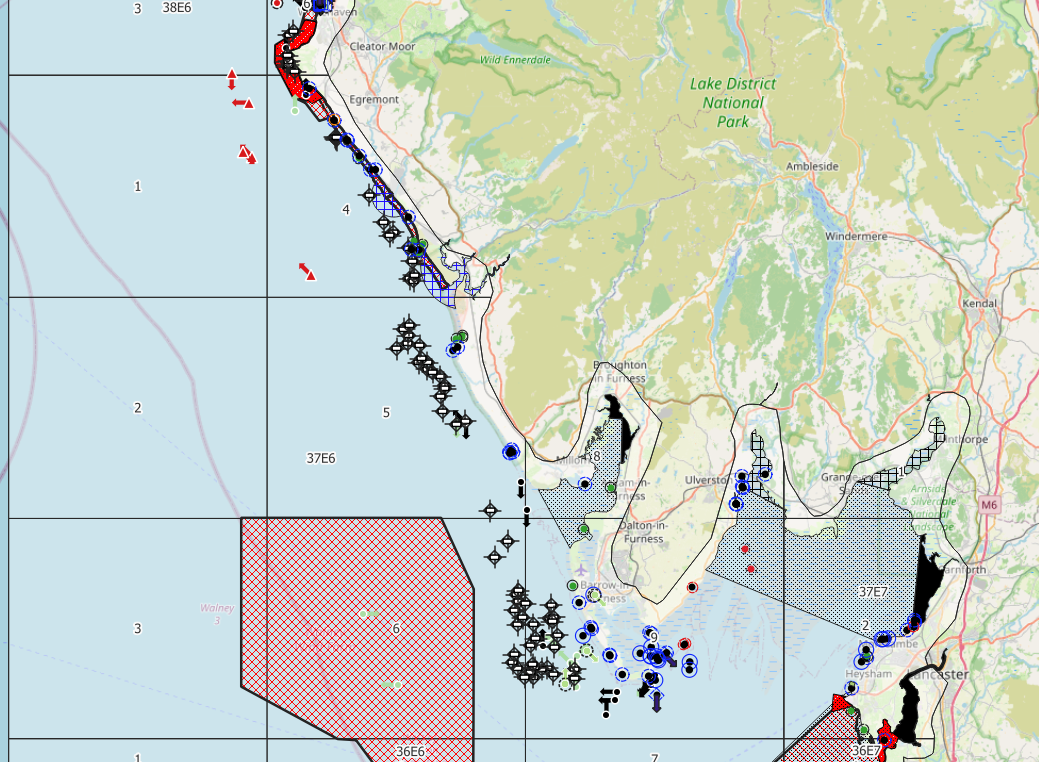
Two more projects complement the picture. The Vessel project is used by the crew on the large patrol vessel and logs fishing gear in the water: lobster pots with tags, skipper, date and time, vessel details and photos. In the Patrol visit project, Officers tap a checkpoint on arrival and log date and time. This allows Robin to make heatmap visualizations of the visited checkpoints and to identify the most under-patrolled locations.
.png)
From the ground to the office and from the office to reports
All three projects sync into a main QGIS database on NWIFCA’s own server. At this stage, it was chosen to keep that separate from Mergin Maps, to make access easier across the whole team. Live projects sit on the drive of a central computer, and Robin has built a simple automated workflow in QGIS to update the projects with new feature entries. With everything landing in one place, the science team can finally start asking questions of the data rather than just assembling it.
The consolidated data feeds patrol effort maps that show how often officers actually reach each location, and the first ones drawn made the coverage gaps impossible to miss. Sightings density by area sits alongside them, and Atlas layouts now automate much of the reporting that was once assembled by hand. The first quarterly reports went to the head of enforcement and senior officers this summer, and Robin is eagerly waiting for the point when he will have years’ worth of data to work with.
When the data mounts up: Towards long-term storage and other features
Data will mount up quickly, which is why long-term storage is the next thing on the priority list. Robin is looking at PostgreSQL and a hosted server, with db-sync as the likely route, and he is candid that it is unfamiliar ground. In the meantime he has already started using the new filtering feature, and he is signing up for early access to project sharing so that the head of enforcement can interact with the data directly without ever opening QGIS. Give it a few seasons of records, and the science team can start pulling out trends that were never visible before.


