Appearance
Checkbox
The checkbox widget is handy when you want to set up a field that can have two values, such as true/false, Yes/No, or On/Off.
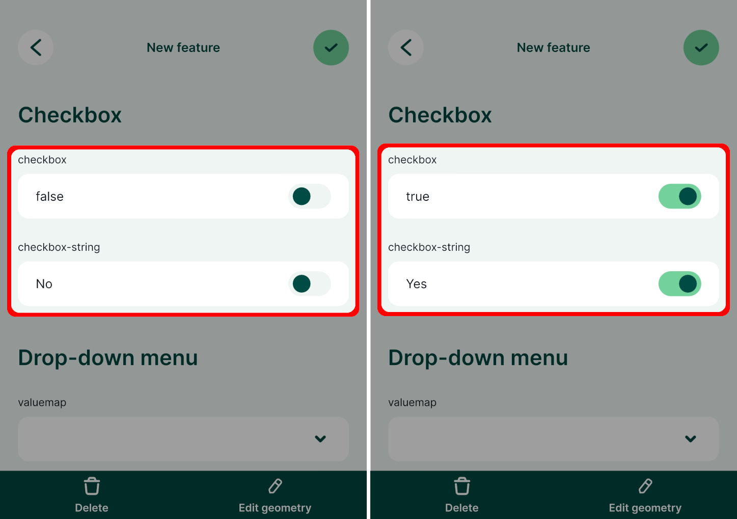
Widget | Preview in the mobile app |
|---|---|
| True/false checkbox |  |
Example project available
Checkbox widget is used in this public project documentation/form-widgets. Download or clone it to see the setup.
Prefer a video? Here is a short tutorial about the checkbox widget:
True/false checkbox for Boolean fields
If you have a field with a Boolean data type, QGIS assigns the checkbox widget type by default. It is also possible to use it for fields with other data types.
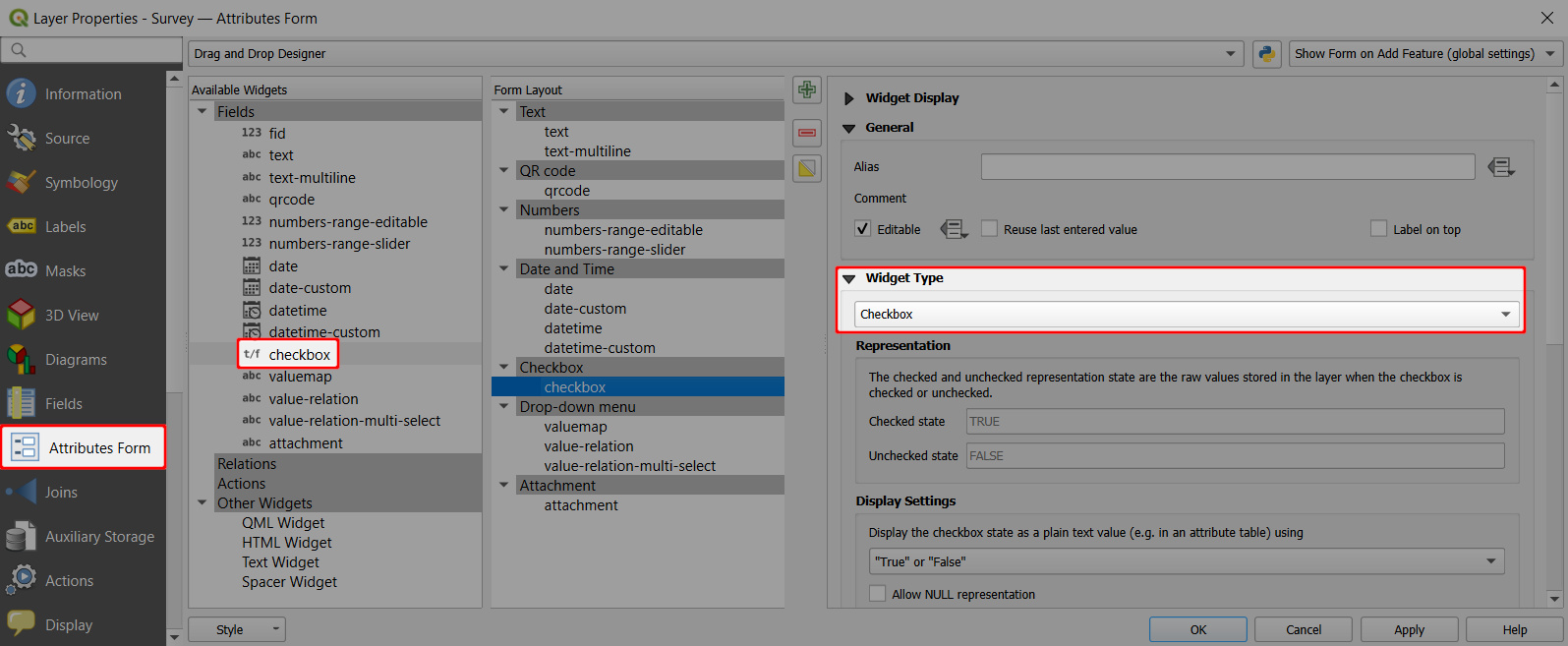
- Right-click on a layer, select Properties and go to the Attributes form tab.
- In the list of Available Widgets select the field you want to work with (here:
checkbox). - In the Widget Type tab, the Checkbox widget should be set by default (if not, select it from the drop-down menu).
- Apply the changes. Don't forget to save and sync your project!

Checkbox with custom values (yes/no)
You might want to use the checkbox with custom values, such as Yes/No or On/Off. This is possible for fields with Text (string) data type:
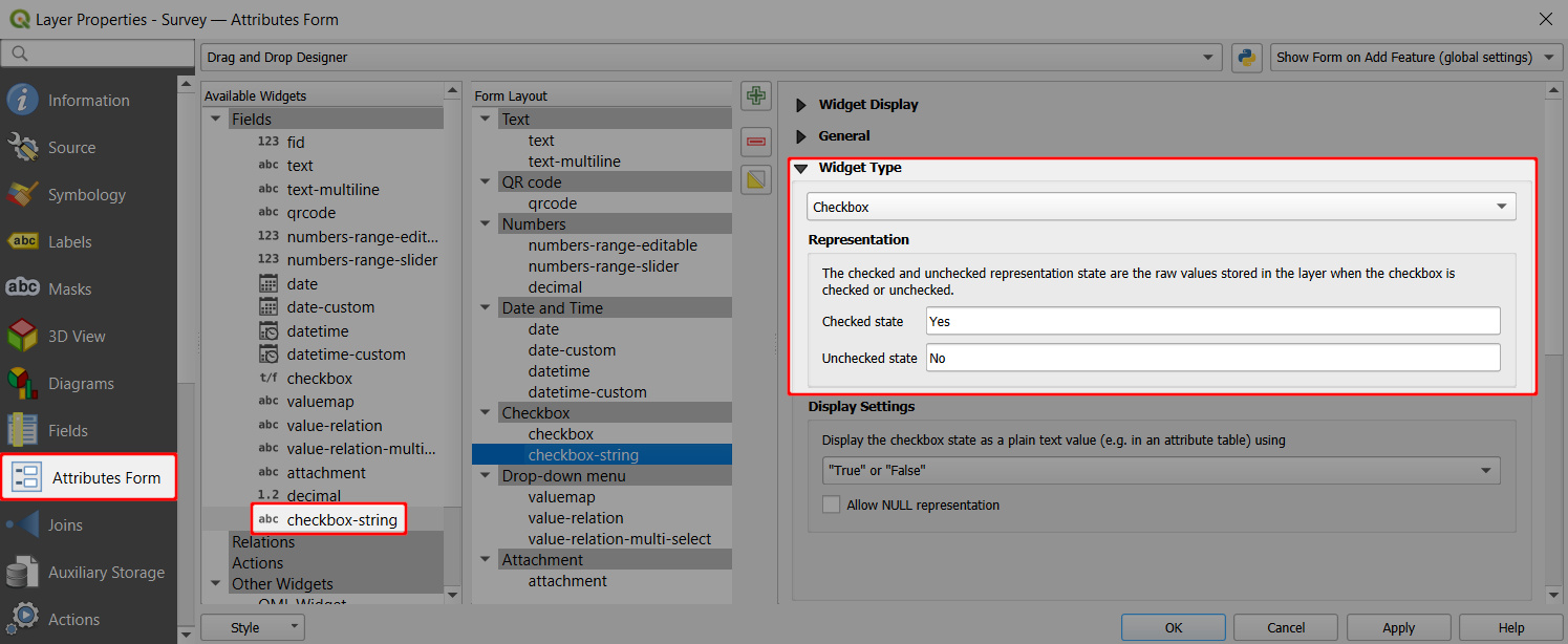
- Right-click on a layer, select Properties and go to the Attributes form tab.
- In the list of Available Widgets select the field you want to work with (here:
checkbox-string). - In the Widget Type tab, select the Checkbox widget and define values for the Checked and for the Unchecked state. Here we use
YesandNo. - Apply the changes. Don't forget to save and sync your project!

Similarly, you could set up the checkbox widget for fields with integer data types and use numerical values, e.g. 0 and 1, for the Checked and for the Unchecked state.
In the mobile app, the checkbox can be easily toggled on/off.
